
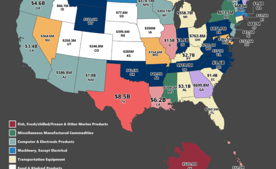
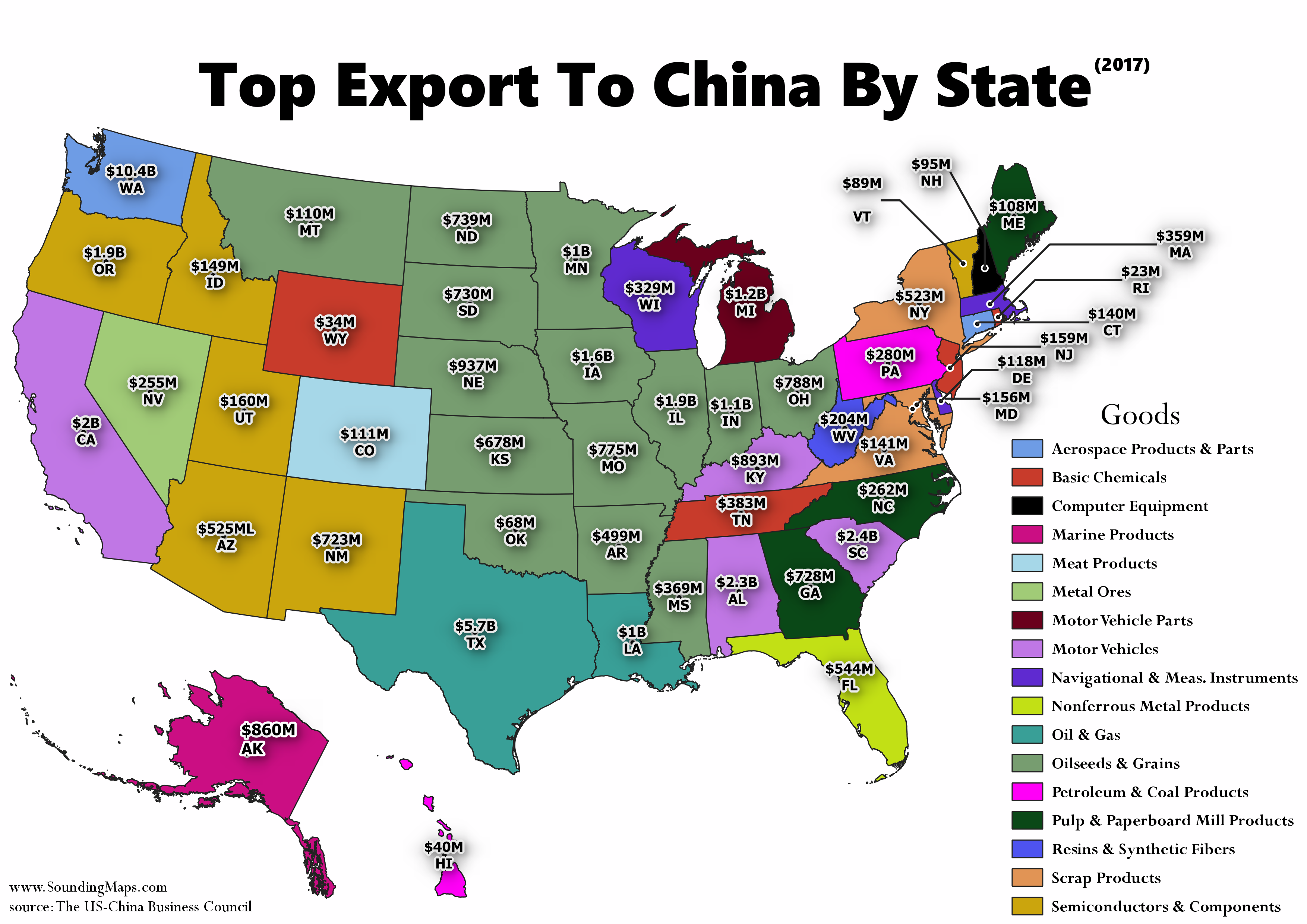
Mapped: The Largest Export Good to China of Every State This map visualizes the most significant export goods to China by each state. The Midwest overwhelmingly exports food and kindred products, including meat, dairy, vegetables, and grains. A good portion of the food products in the Midwest states were meat. […]
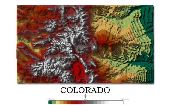
Contour Elevation Map of Colorado Each contour in this Colorado topographic elevation map represents a change of 50 meters or approximately 164 feet. Colorado is notable for its diverse geography, which includes high plains to the east, alpine mountains to the west, and deserts with massive sand dunes and deep […]
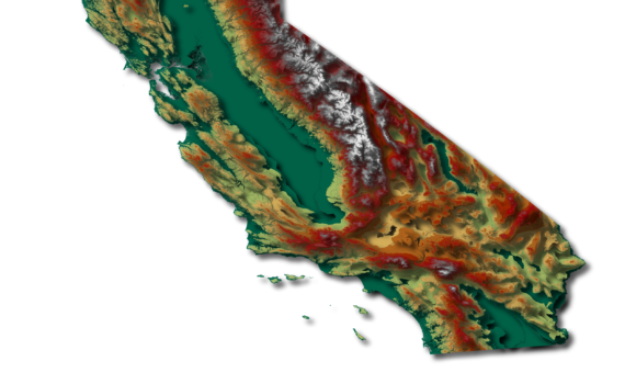
Contour Elevation Map of California In this California topographic elevation map, each contour represents a change of 100 meters or 328 feet. California is the third largest state in the Unites States after Texas and Alaska. It has an area of 164,696 square miles (423,970 km2). Coincidentally, California is home […]
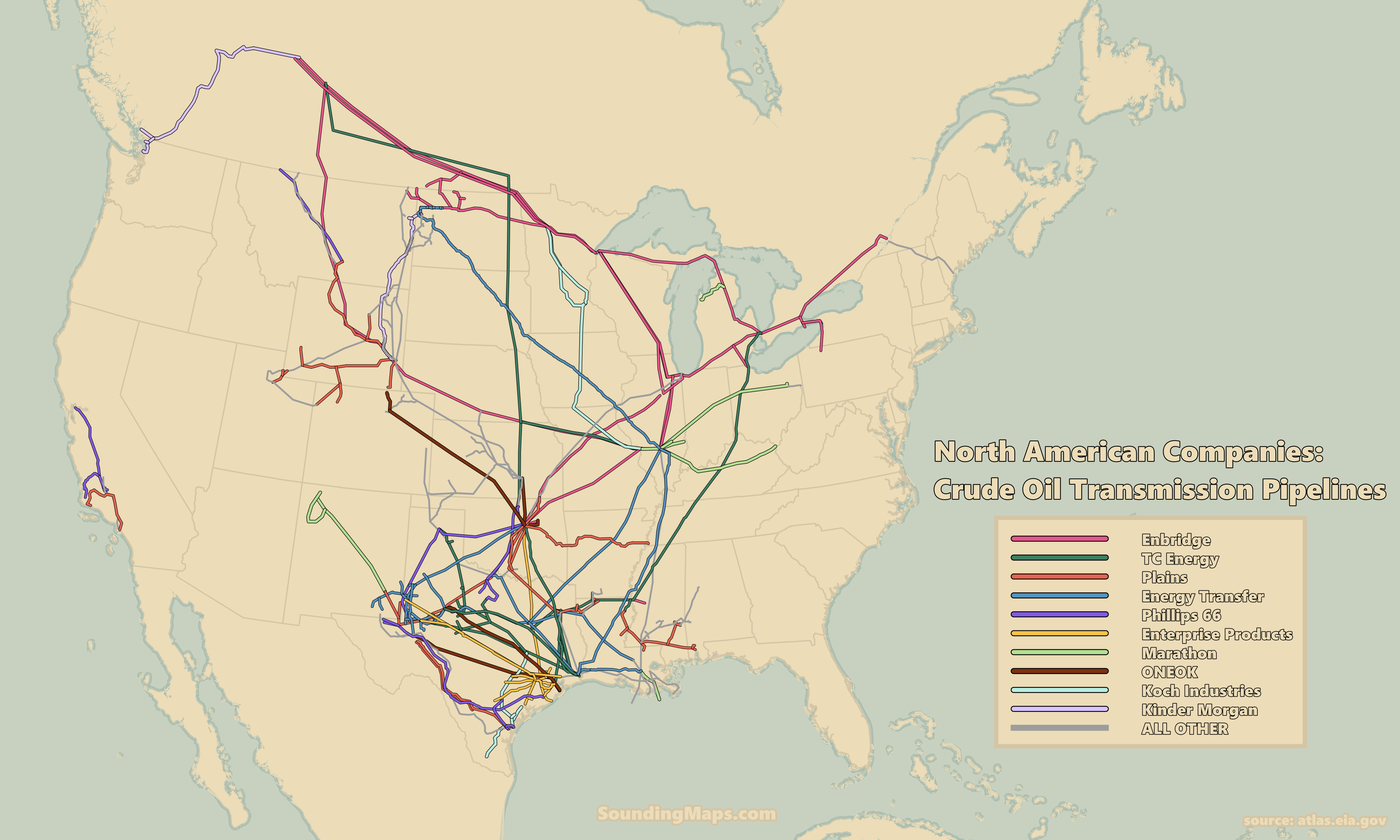
This map visualizes the ten significant companies’ dominance of crude oil transmission pipeline infrastructure throughout the United States and Canada. Selected by pipeline length, it is a map of the United States and Canada’s major crude oil pipeline networks. Ten North America crude oil companies dominate the energy transmission network. […]
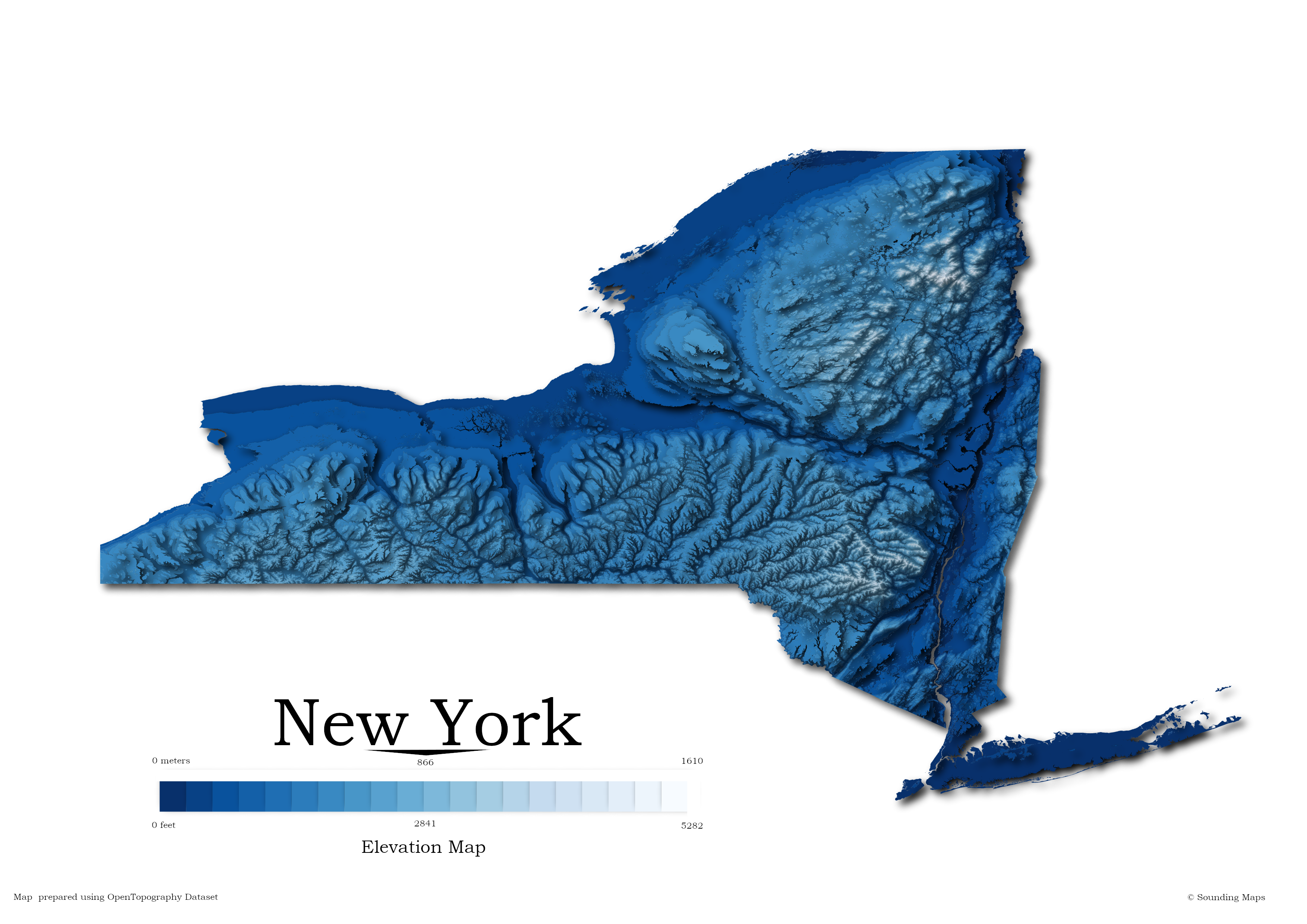
Contour Elevation Map of New York State In this New York topographic elevation map, each contour represents a change of 100 meters or 328 feet. From the map, it’s easy to identify where interstate 90 (I90) runs. Beginning in Albany, I90 stretches across low elevation through Rochester, Syracuse, Rome, Utica, […]

This map shows cell towers in the US licensed by the three largest cell service providers: Verizon, AT&T, and Telephone and Data Systems. With the increase in mobile network usage, the demand for network coverage has increased, and companies like Verizon, AT&T, and Telephone & Data Systems have expanded their […]
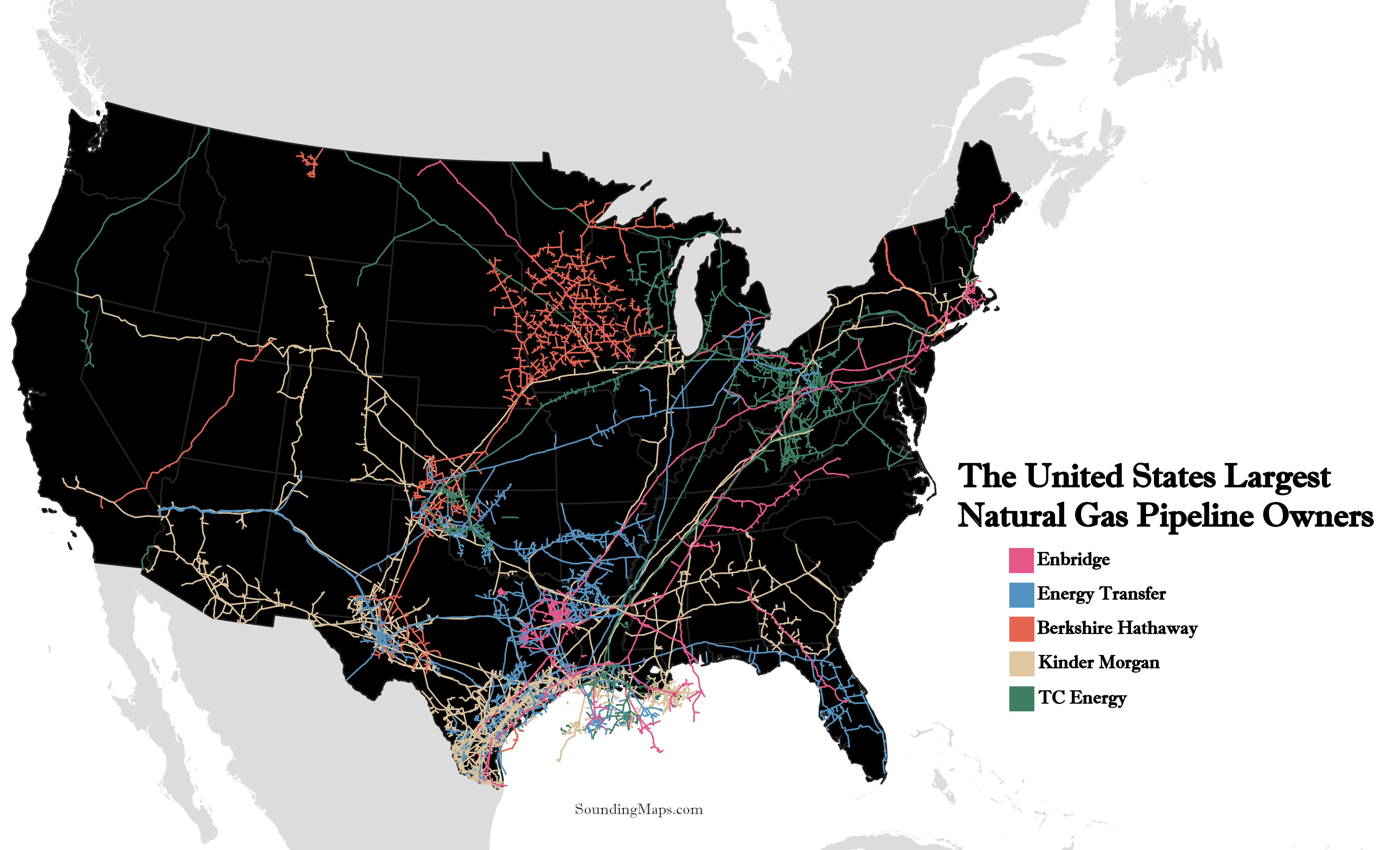
The Natural Gas Pipeline Landscape in the United States Categorized by pipeline company, this is the extensive map of natural gas pipelines in the United States. The natural gas pipelines in the US, are dominated by 5 large players. By exploring the map above, you’ll get a better understanding of […]
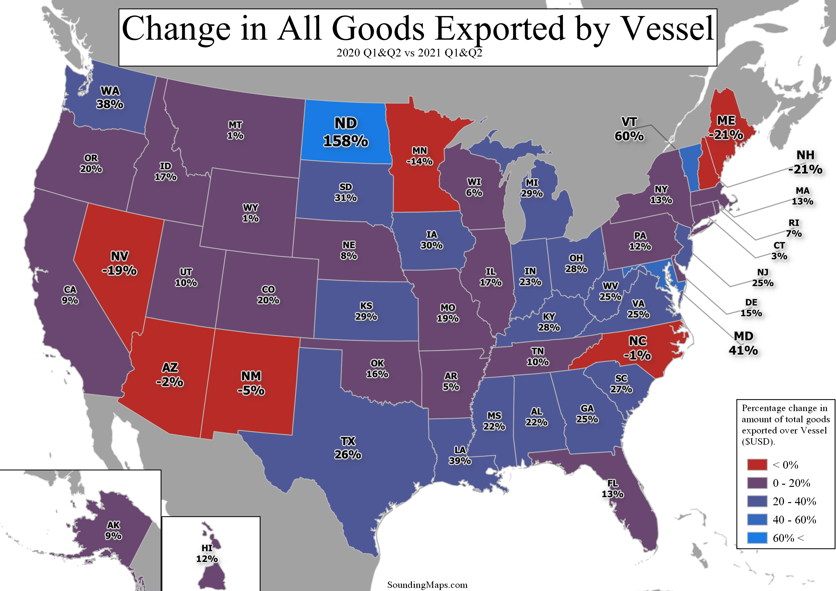
Now, this map shows key states that are adopting new modes of exporting goods. The mode being vessel. Vessel Exports Data was gathered from USA Trade Census and goods were classified using the HS code system. The vessel exports change was calculated taking the value of trade through vessel ports […]

The United States COVID-19 vaccine dose map displayed above shows the states total number of COVID-19 vaccination doses administered per 100 people. The data used is counted as a single dose and may not equal the total number of people vaccinated. For example, one person may have received 3 doses […]
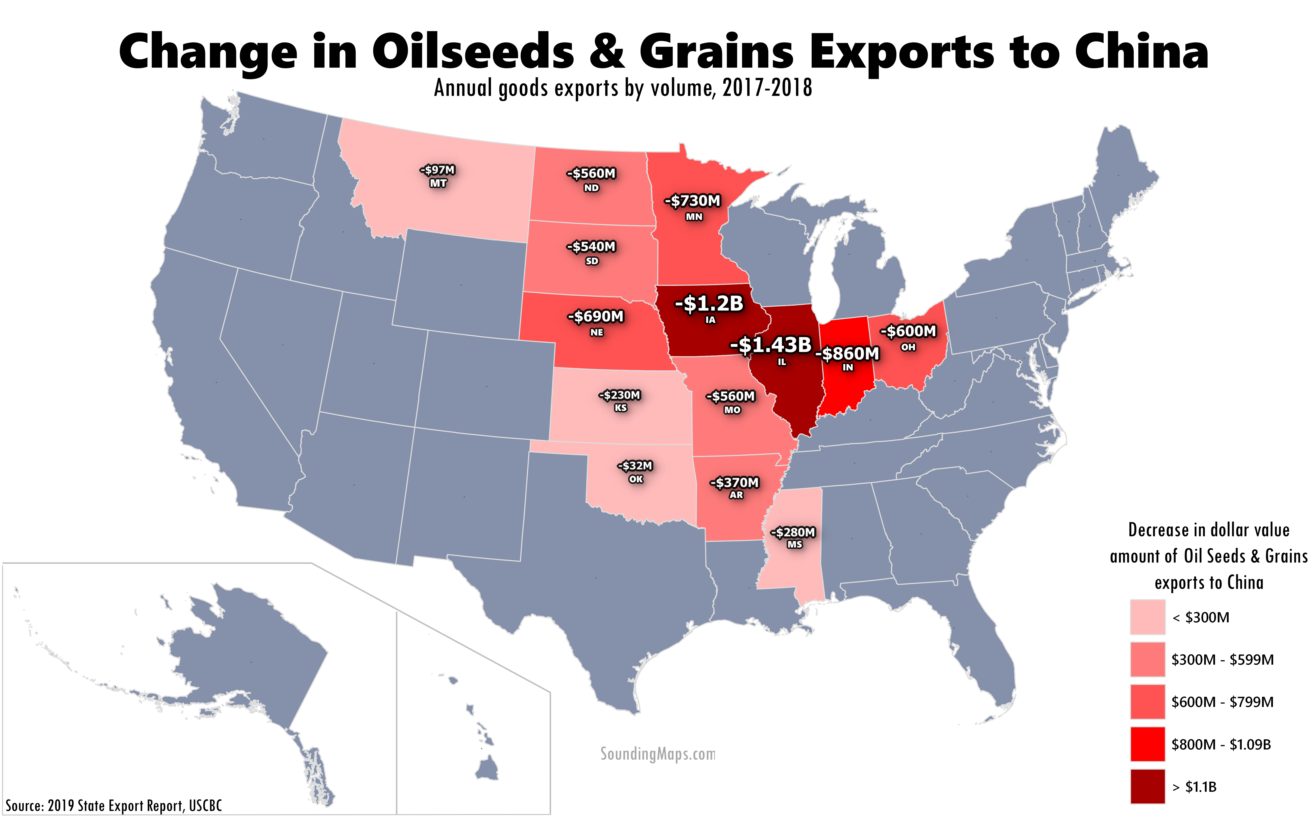
US China trade grain exports plunged between 2017 and 2018. China grain traders pulled back substantially on American Oilseeds & Grains between 2017 and 2018. The fourteen states colored above represent the top exporters of the product. Despite the decline, goods exports to China still outpaced export growth to the […]
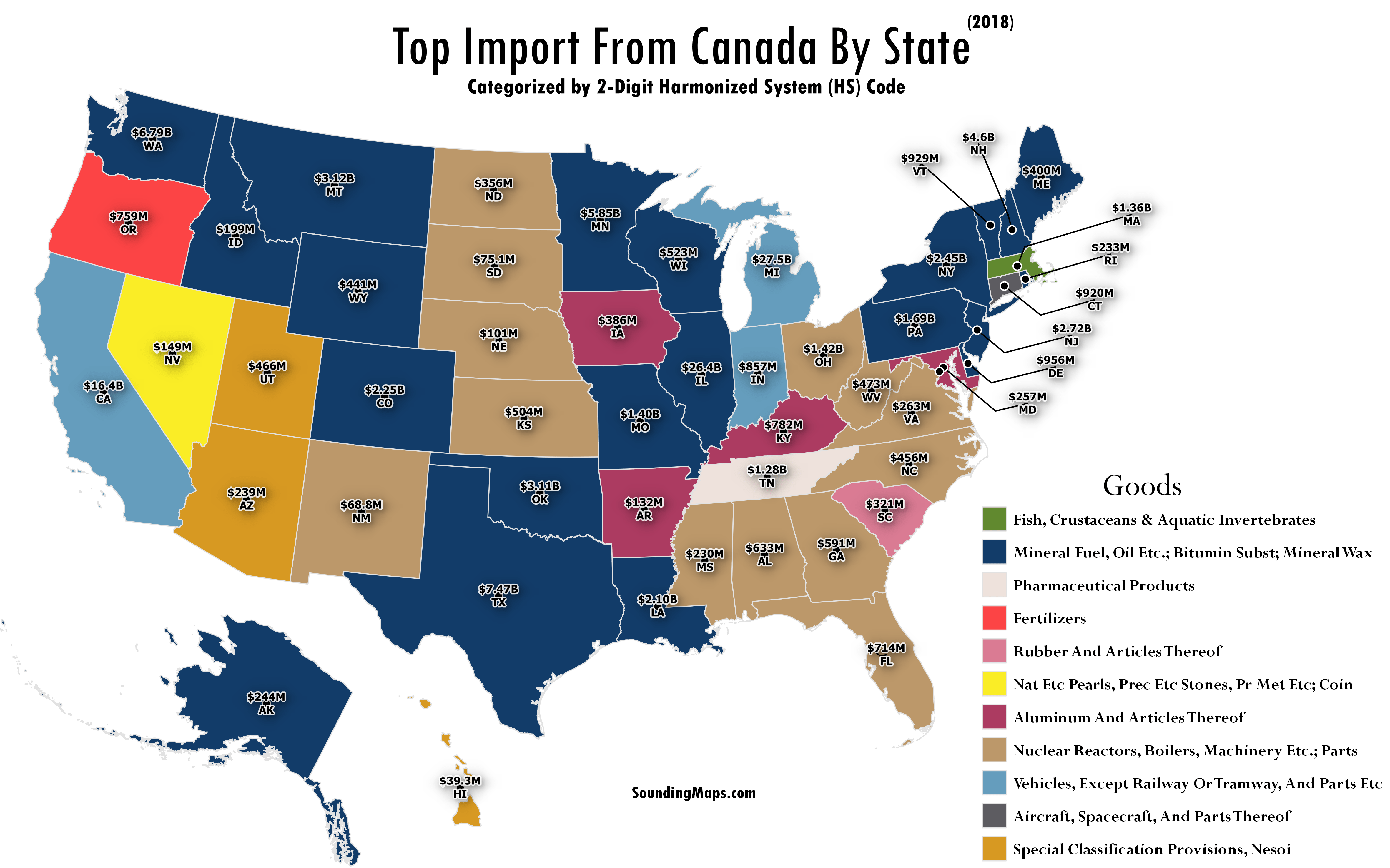
This map visualizes key US Imports from Canada categorized by 2-Digit HS codes. The HS code is an international nomenclature for the classification of products. The goods shown are the top import to each state from Canada. US imports from Canada totaled $318.8 billion in 2018 resulting in an 11% […]
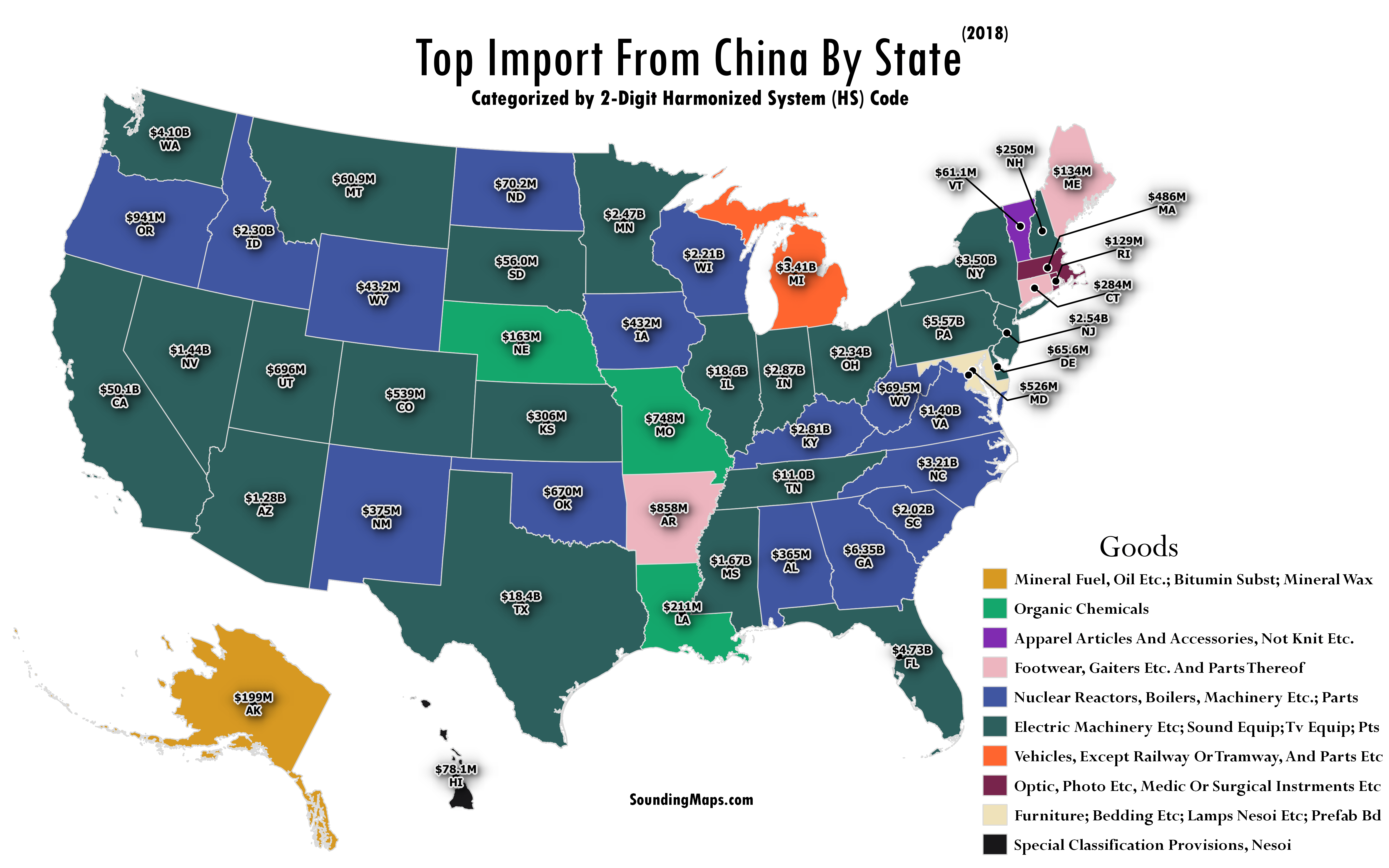
This map highlights the top imports to the United States from China for each state categorized by 2-Digit Harmonized System (HS) codes. The HS coding system is an internationally standardized system of names and numbers to classify trade products. Although using a 6 digit code will provide more insight into […]
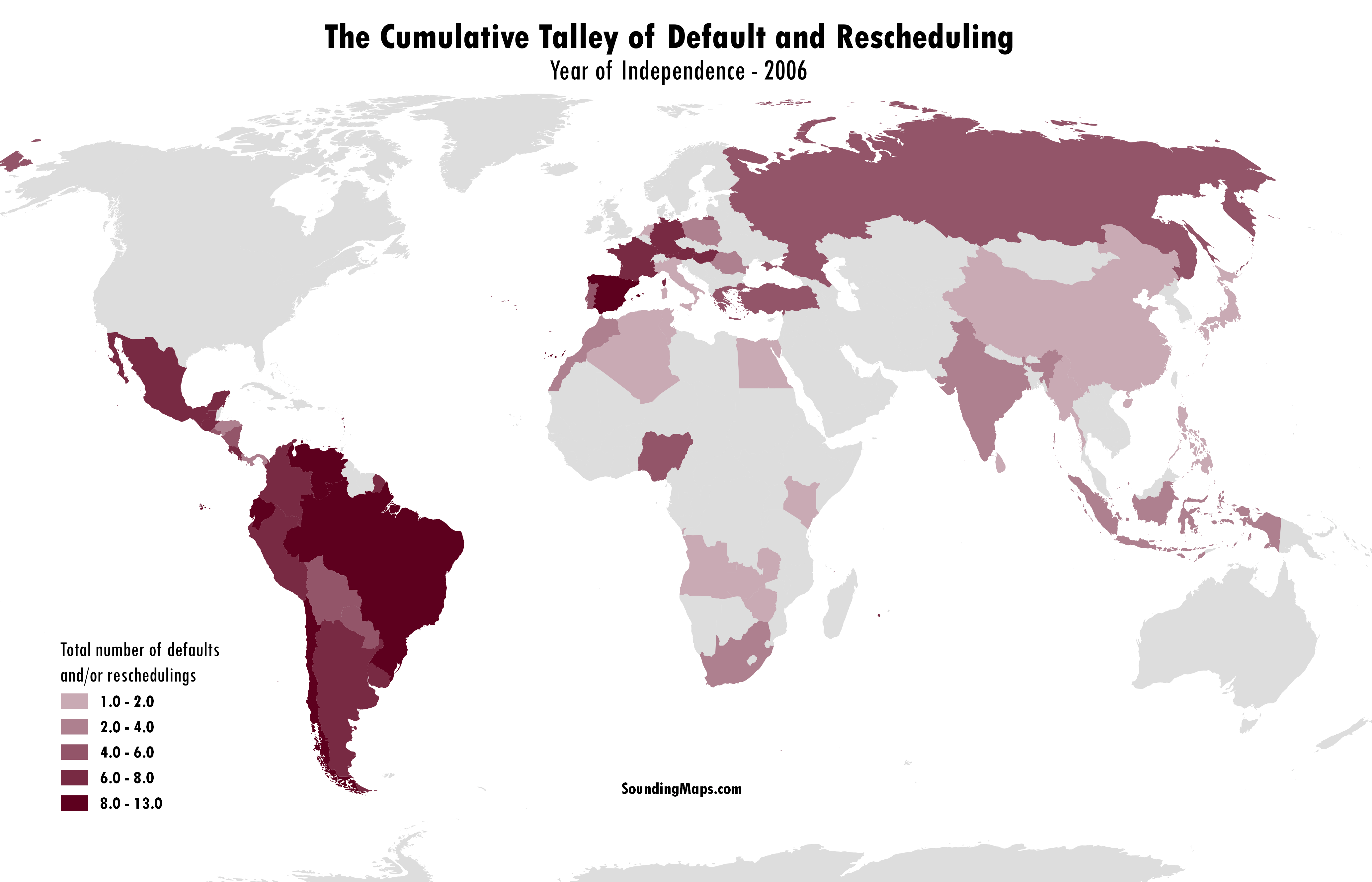
An explosion of international defaults took place starting in the nineteenth century. This resulted from a combination of the development of international capital markets together with the emergence of a number of new nation states. Countries debt defaults are illustrated with dark red. A majority of these countries with debt […]
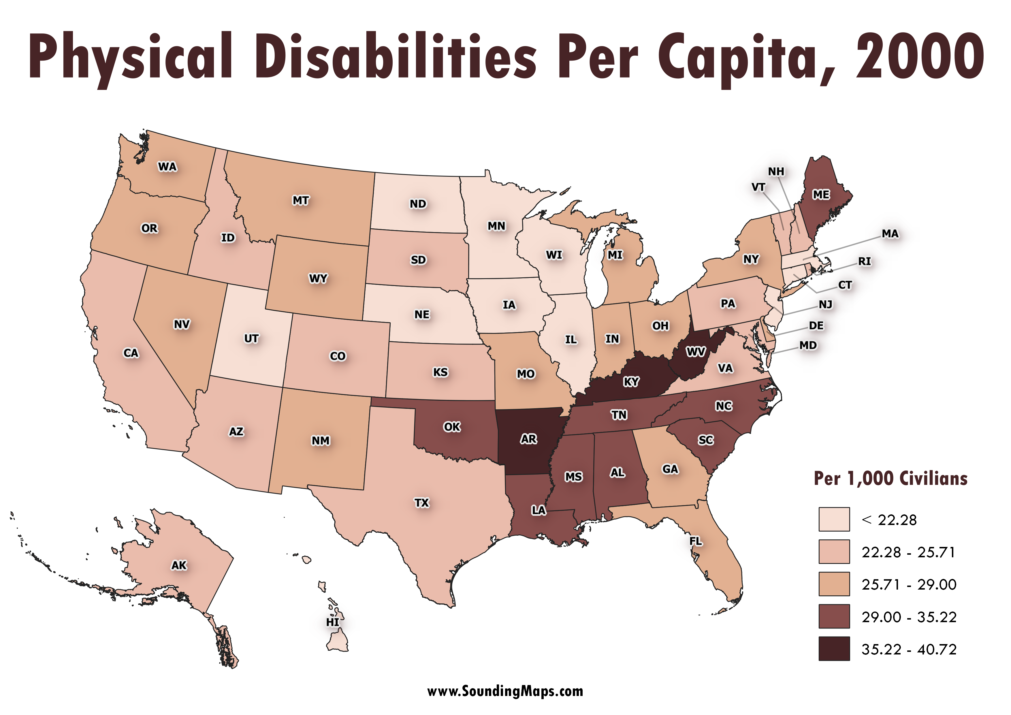
Physical disabilities USA! This map reveals the cluster of states with high rates of physical disabilities measured per capita. Turns out, the concentration take holds in the South Eastern United States. Census 2000, marking the turn of the millennia, surveyed disability status’ of Americans. The total count of a person […]

The Year of African Independence Dates This map shows each African nation’s independence dates. 1960 is referred to as The Year of Africa, mainly because of the independence of seventeen African countries. Most gained independence from Belgium, France, and the United Kingdom. Following most African colonization between 1880 and 1900, the struggle […]
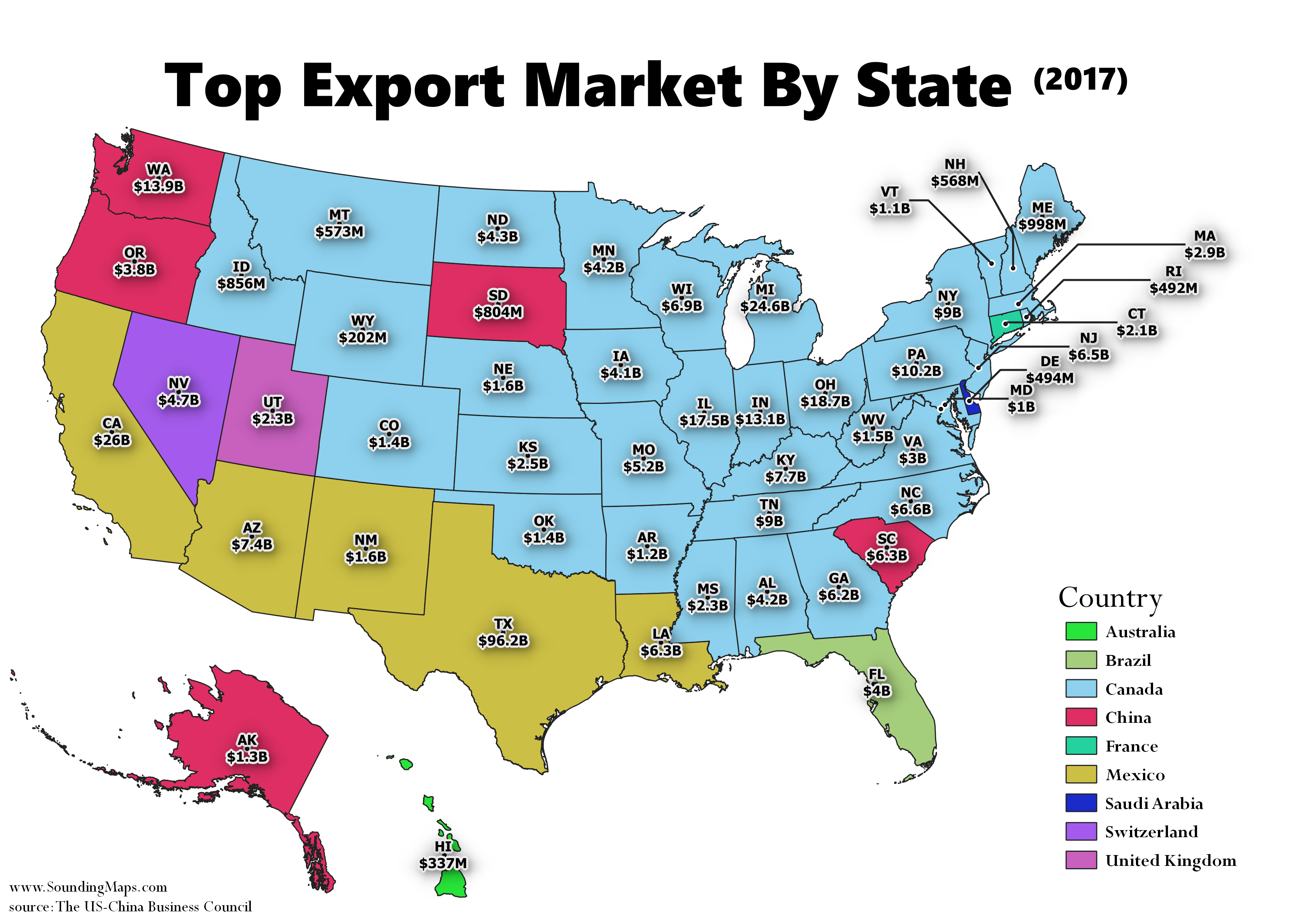
This map shows the United States biggest export markets for each state. In 2017, Canada was the United States biggest export market for 33 states, and exports to Canada across the country totaled $282.3 billion. Both China and Mexico are the top export market for 5 states. The top exports to […]
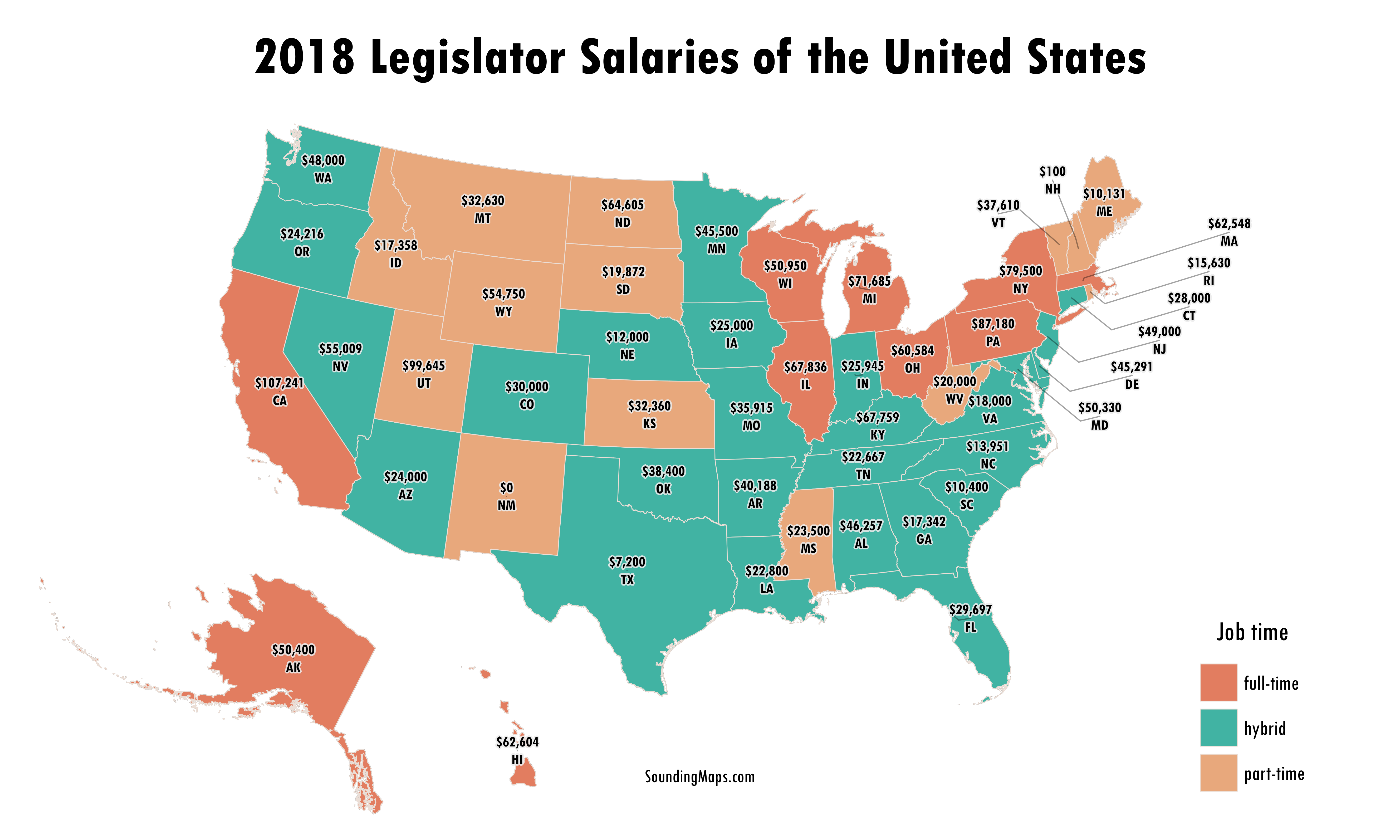
Have you wondered what your state legislators make for a salary? Ever care to think what the people making your laws are paid? To be honest, not really. Although I was a bit surprised to learn the amounts. This map shows various US legislator salaries including senators and representatives. There […]

Now, categorized by operating revenue, this is the 2018 North American biggest railroads map. The USA rail network is dominated by 5 railroad companies. Read below to see how the 2022 railroad revenue’s compared. The Largest US Railroads Union Pacific is mapped in pink throughout the western United States against […]
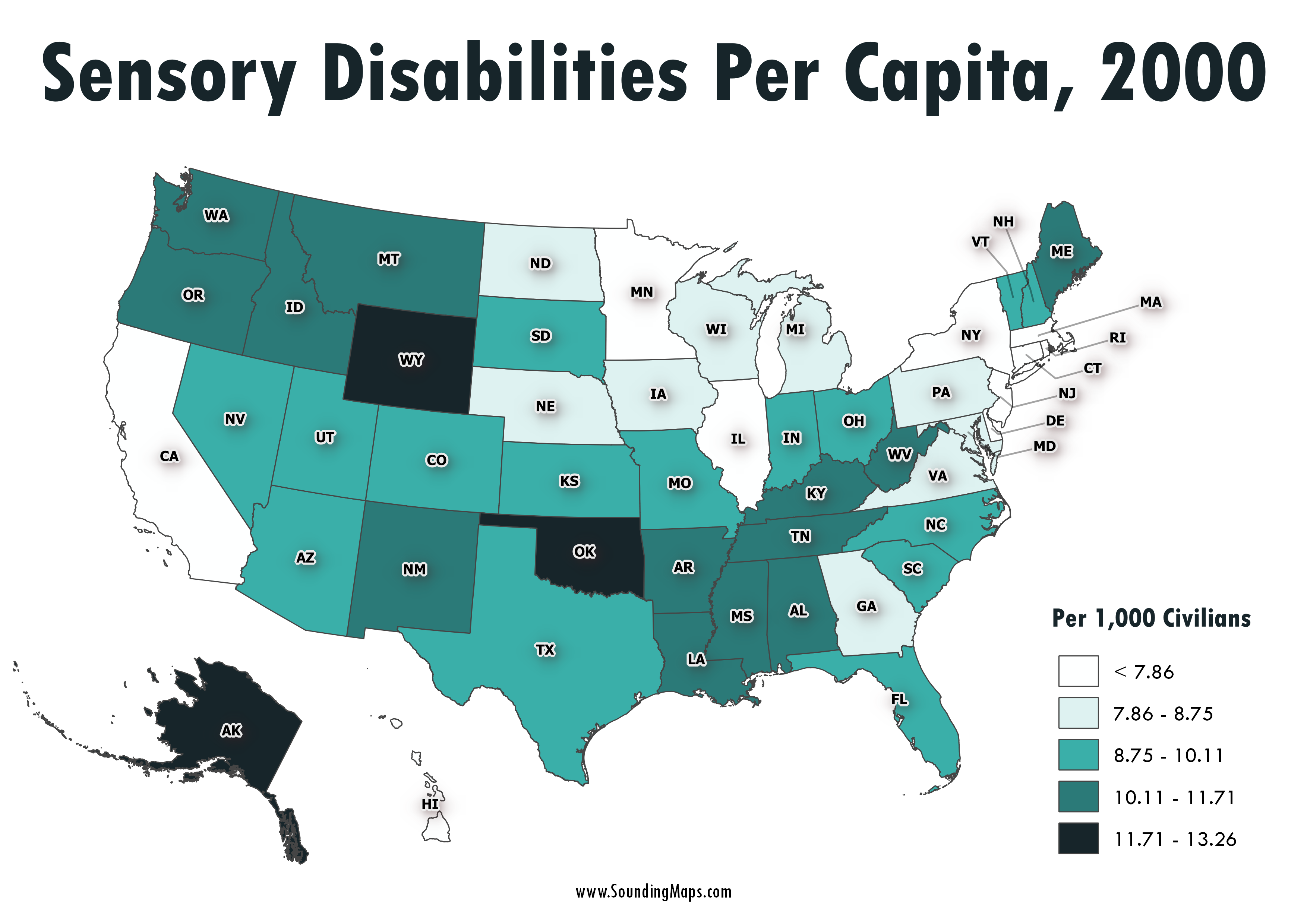
This map shows sensory disabilities throughout the United States in the year 2000. The color coded regions represent disabilities per 1,000 civilians. For instance, Alaska had 12.26 sensory disabilities per 1,000 citizens. Census 2000 counted 49.7 million people with some type of long lasting condition or disability. They represented 19.3 […]
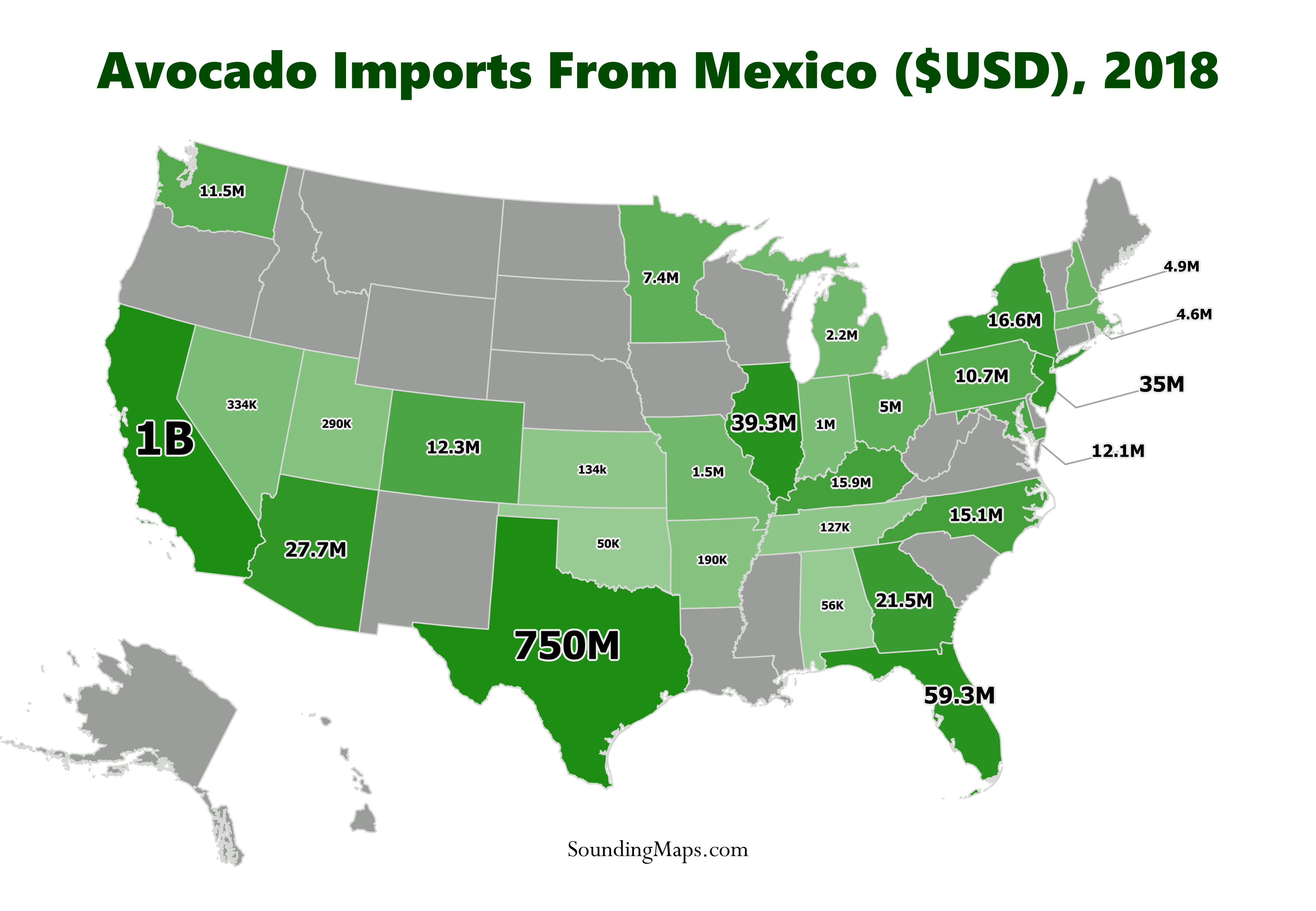
In light of Trump’s threats to close down the border and his recent retaliation of extending his trade war by threatening to impose tariffs against Mexico, this map demonstrates the impact of US avocado imports against Mexico. In 2018, the avocado imports from Mexico generated the country approximately $3 billion. […]
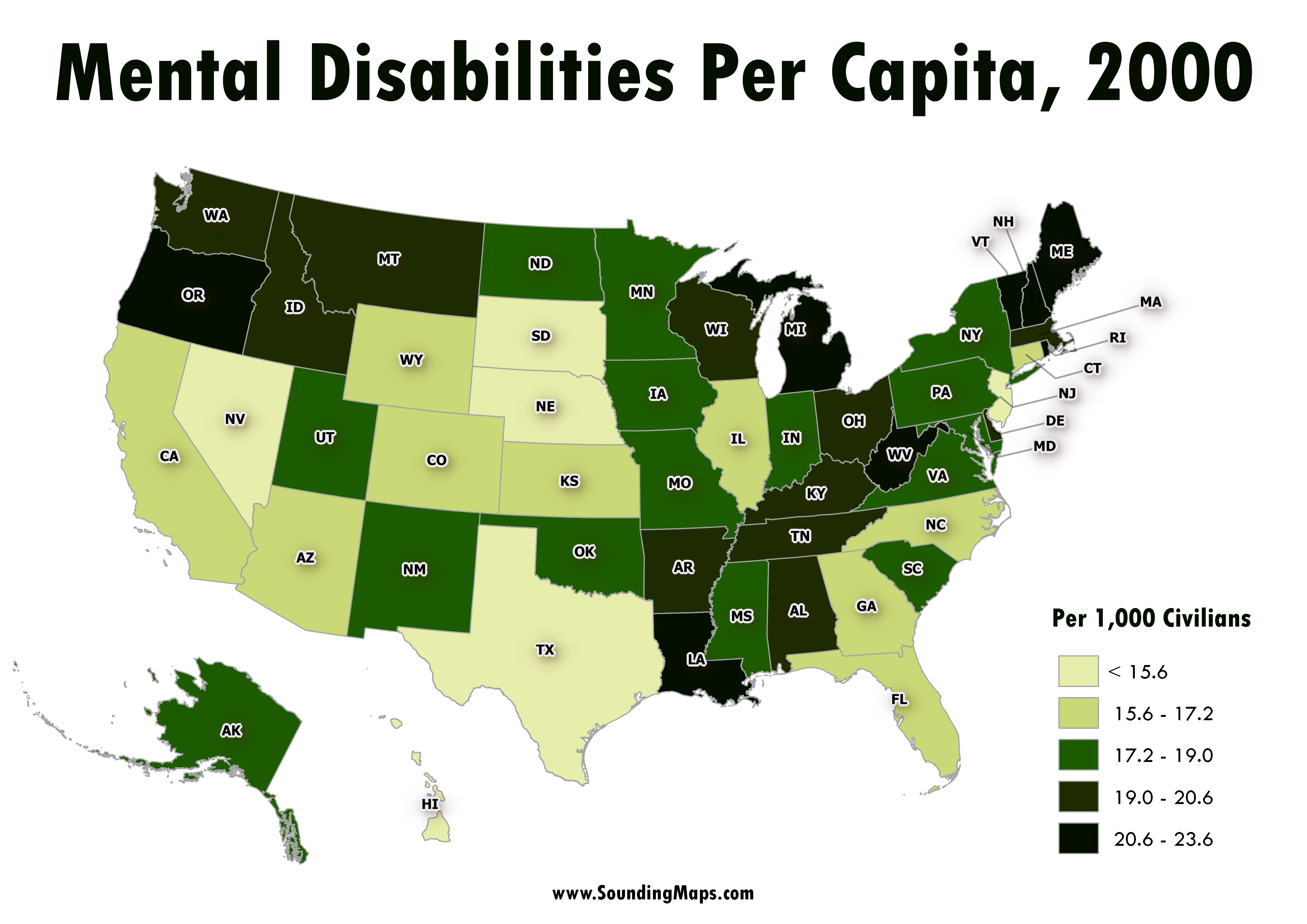
This map represents the mental disability status of the civilian non-institutionalized population of the United States regions in the year 2000. Census 2000 counted 49.7 million people with some type of long lasting condition or disability. They represented 19.3 percent of the 257.2 million people who were aged 5 and […]
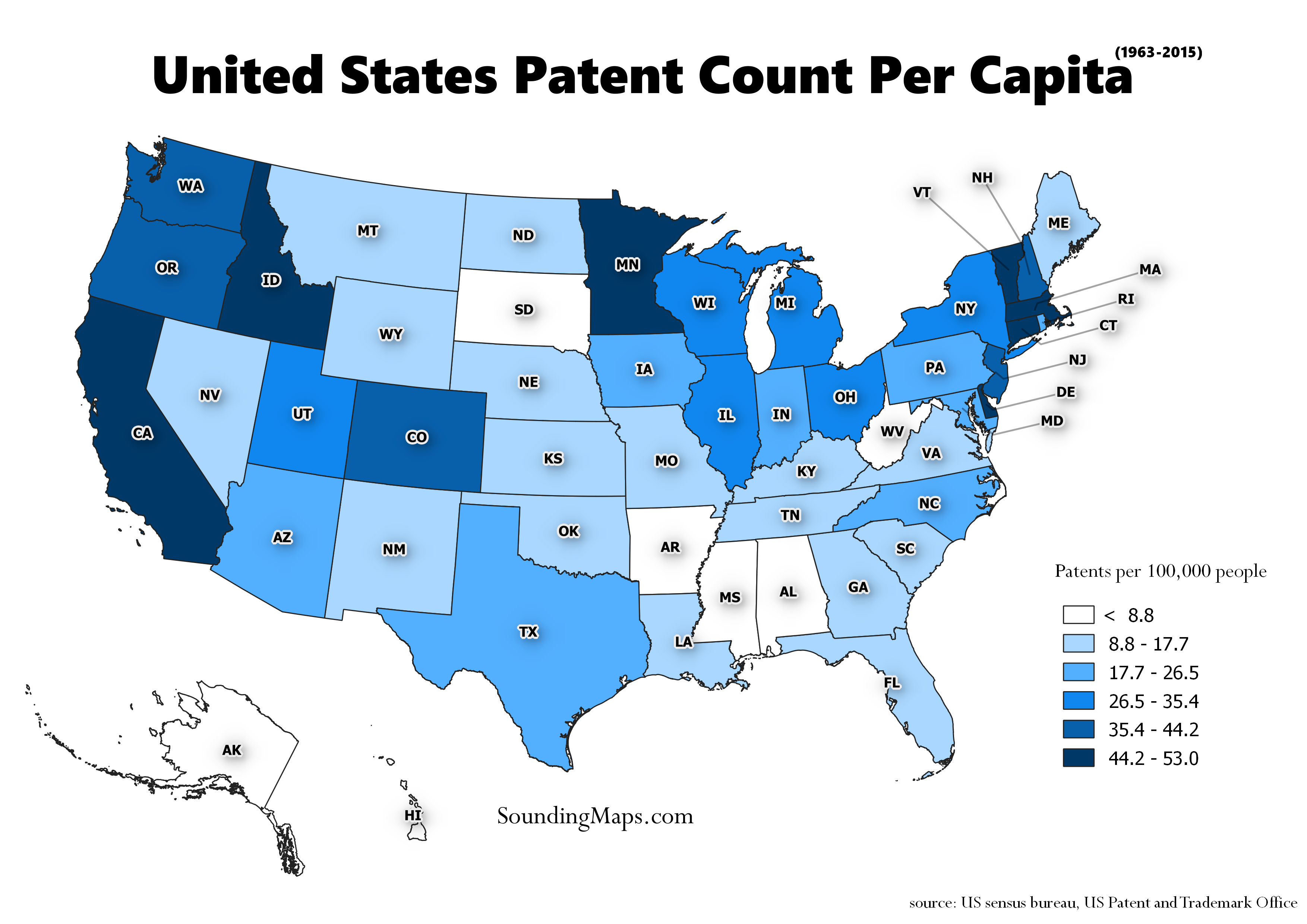
Overview of States with the most Patents This map visualizes the States with the most patents during the period 01/01/1963 – 12/31/2015. The residence of the first-named inventor determines the origin of a patent. Since the data comes from nearly half a century we normalized it over the years to represent […]
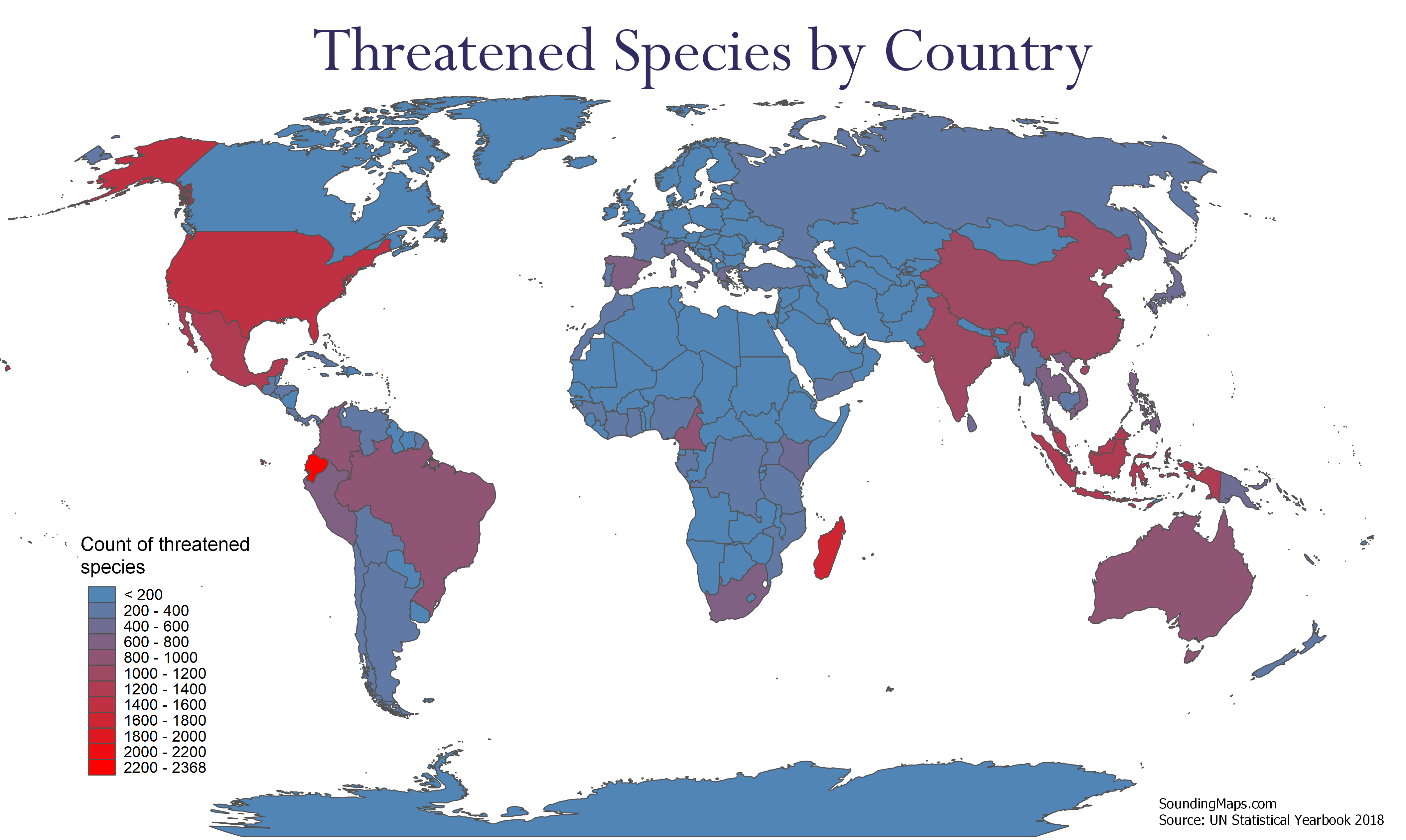
Countries With The Highest Amount of Threatened Species These maps visualizes the countries with a pronounced count of threatened species in 2018. The species include plants, vertebrates, and invertebrates. The threatened category refers to critically endangered, endangered, and vulnerable species. Data was pulled from the 2018 UN Statistical Yearbook 1. […]

We can visualize the percentage of native residents retained in each state. The darker shaded regions represent states that retain more of their native population. Evidently, not much is keeping people in Nevada. This data shows us where people are moving compared to retaining native population. What this means is […]
United States goods exports to China continue to outpace export growth to the rest of the world. In 2017, the United States exported more goods to China than ever before—more than $127 billion. The exports to China have grown by 86 percent over the last decade, while exports to the […]