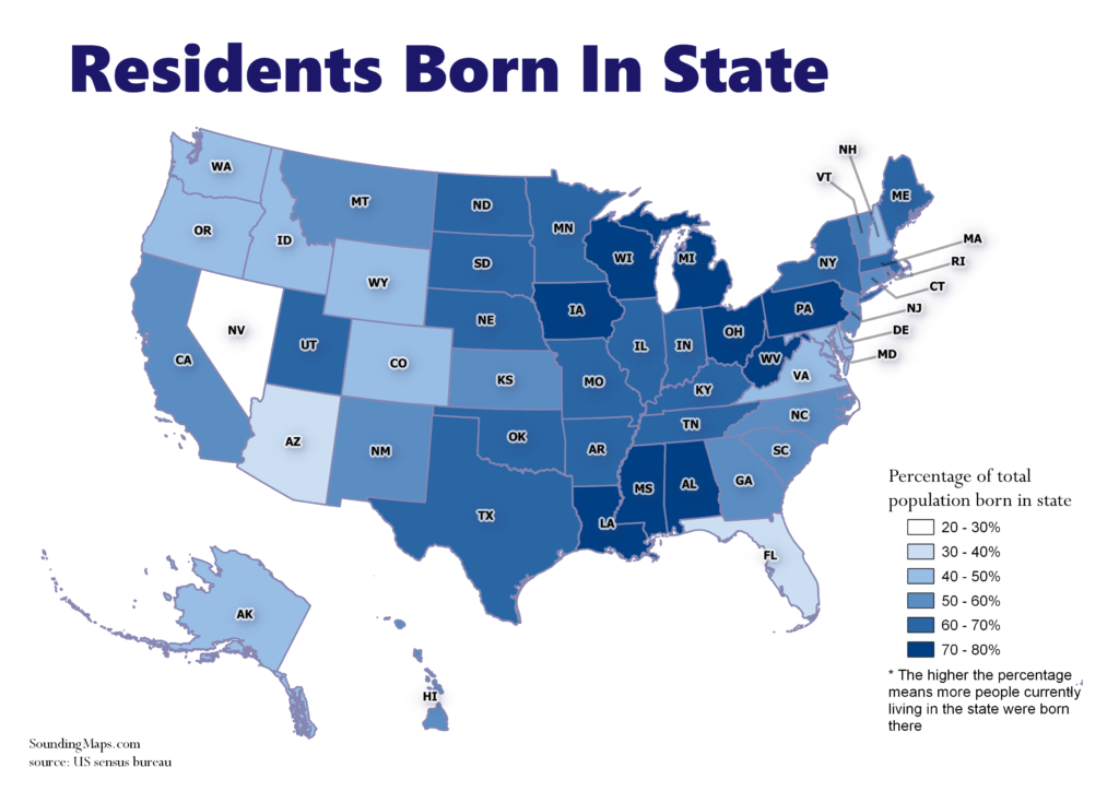
We can visualize the percentage of native residents retained in each state. The darker shaded regions represent states that retain more of their native population. Evidently, not much is keeping people in Nevada. This data shows us where people are moving compared to retaining native population.
What this means is about 20-30% of all living people in Nevada were born there and the remaining are immigrants from other states/countries.
It’s important to note there are several possible interpretations of this data and where people are moving:
- People who live in the same state they were born in, as a percentage of all living people who were born in that state
- People who live in the same state they were born in, as a percentage of all people who live in that state
- Total living people who were born in a state, as an improper percentage of all people who now live in that state
- Total living people who were born in a state, as a percentage of all living people anywhere
source: US sensus bureau


